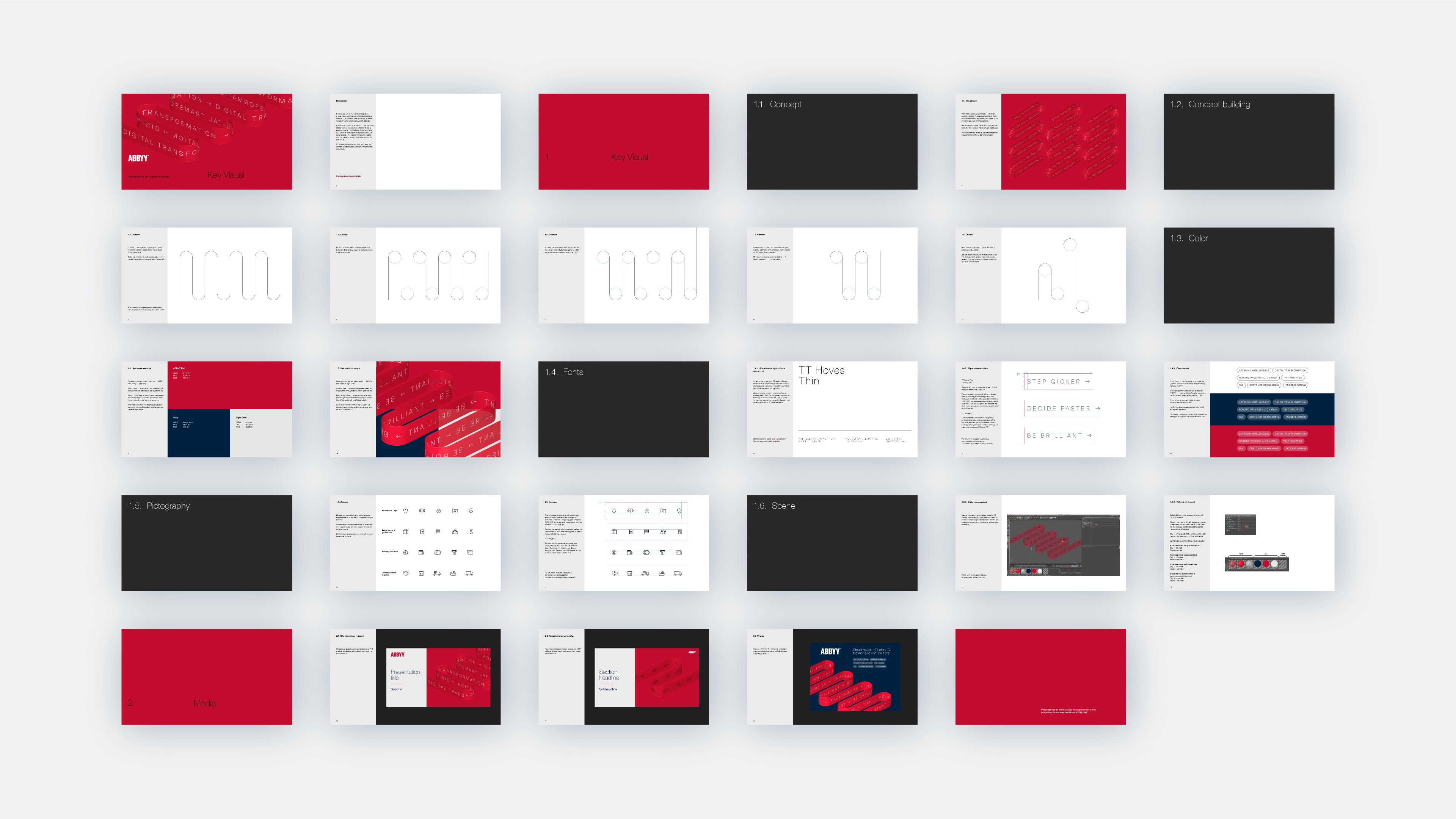
Key visual for ABBYY


ABBYY is an international IT company that develops intelligent information processing and linguistic solutions. The company’s products are used daily by fifty million people worldwide.
Our task was to create a key visual for presentations, exhibition stands, and marketing materials. The solution needed to work effectively both in static form and as an animation.

ABBYY technologies are used across many sectors of the economy, requiring a universal solution that can be applied by all departments within the company.
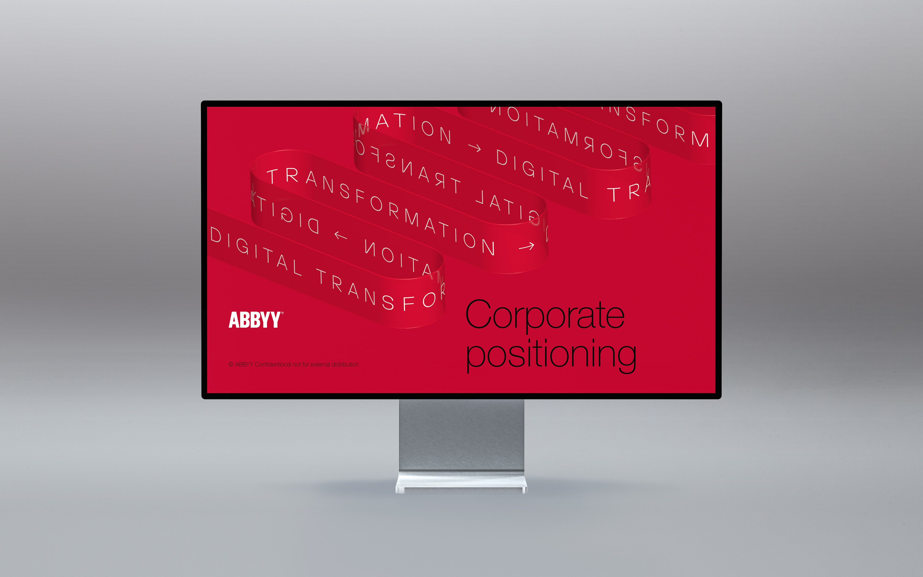
There are two main requirements to address: First, we needed to move away from the overused and uninspiring imagery of neural networks often seen in IT companies. Second, we had to visualize the company’s new overarching positioning: Digital Transformation.
The challenge was to represent an intangible product with a unique and easily understandable image. To achieve this, we developed a flexible system that the client could adapt to various tasks.
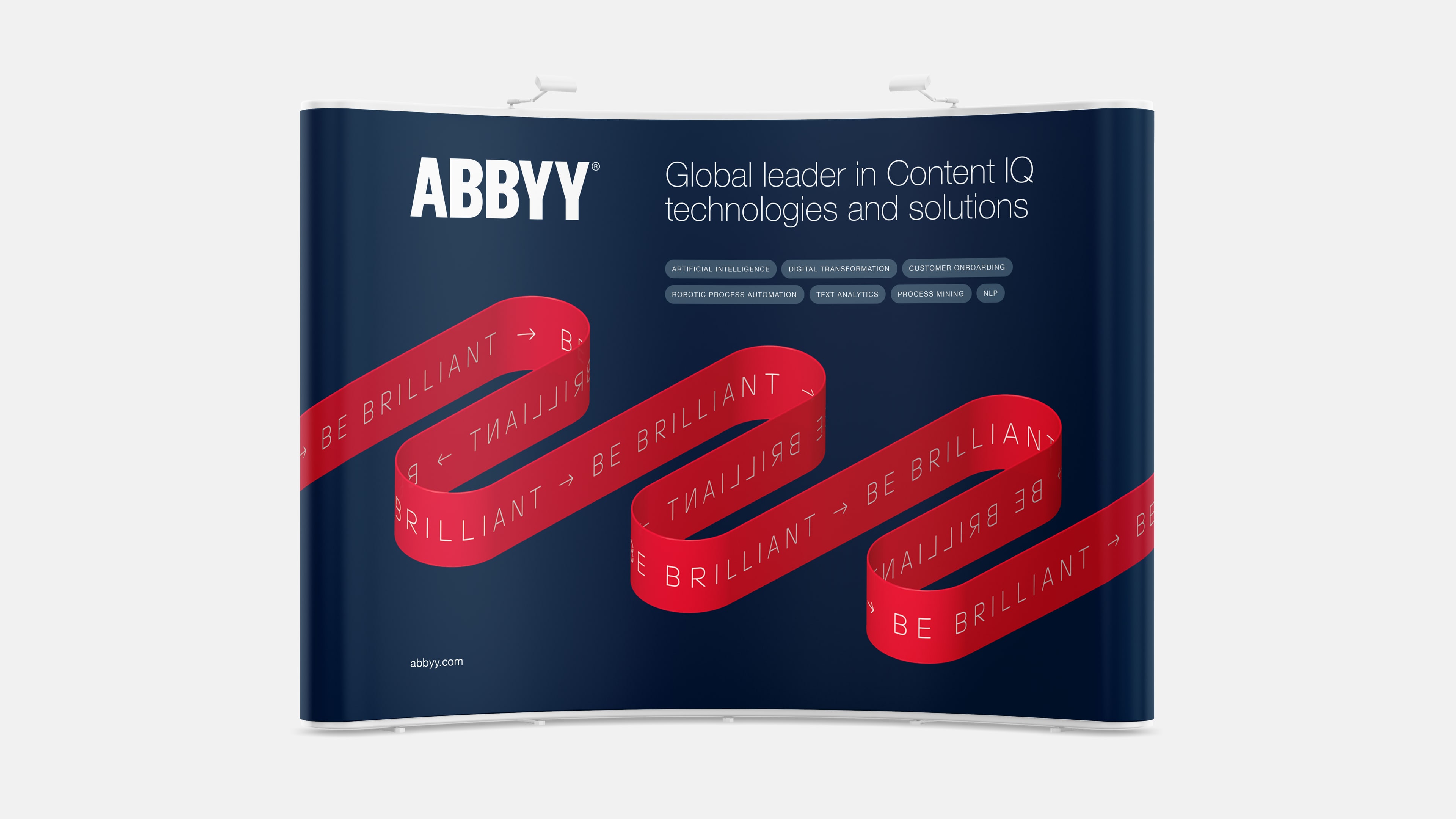
When generating ideas, we were inspired by the metaphor of data flow. We visualized this flow as a translucent ribbon, which serves as a container for data. The data can be represented as text or symbols, depending on the task and message.
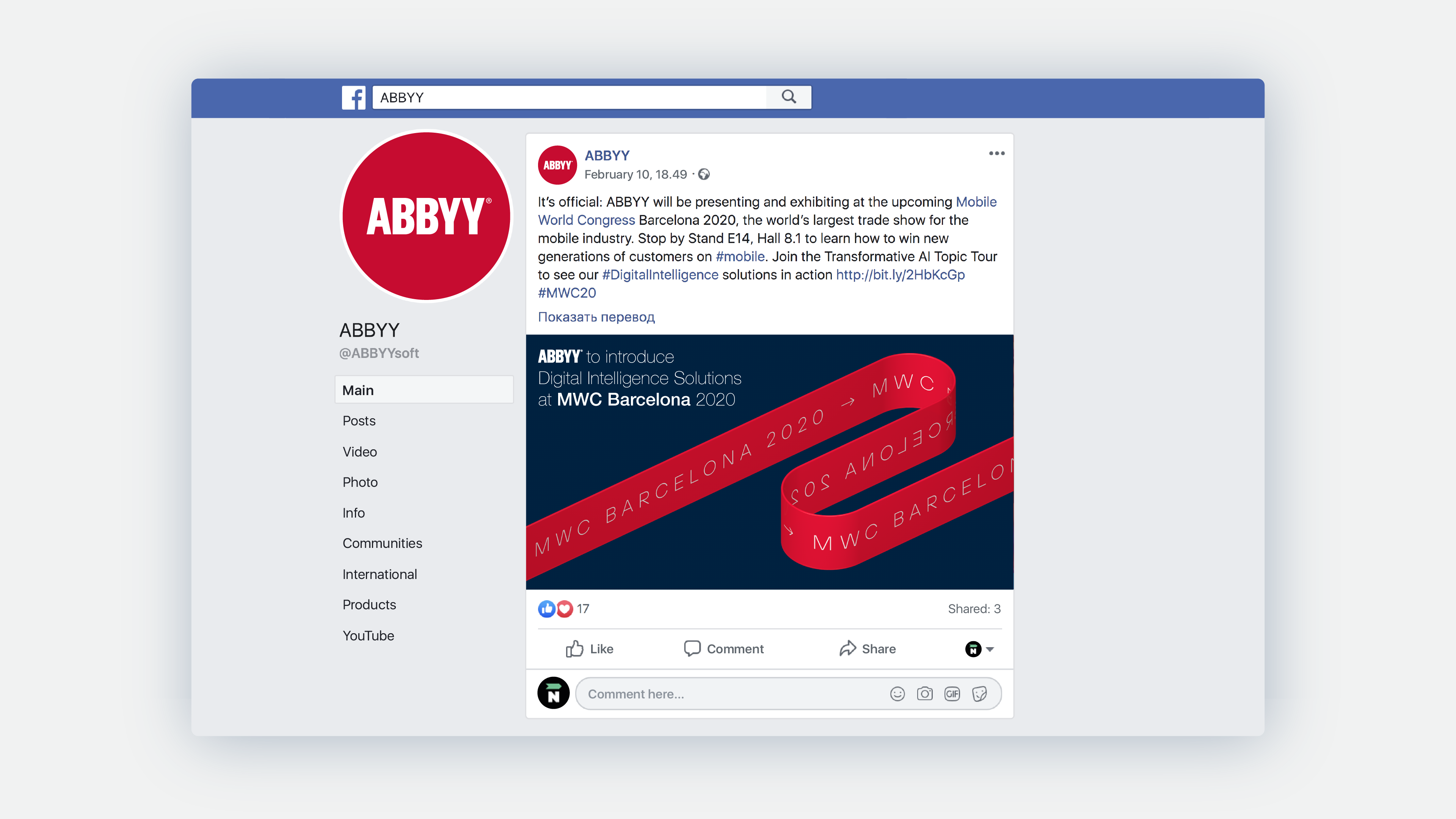
The ribbon allows for the inclusion of both text and pictograms, which can be tailored to fit the specific department within the company where the visual is applied. This makes the solution both multilingual and versatile.

The solution seamlessly aligns with the company’s current style. The ribbon is always in ABBYY’s signature red color, with the most common combination being a red ribbon against a red background. We also developed additional variations, using the red ribbon against blue and white backgrounds.
The number of sections in the ribbon adjusts according to the angle of the frame.
We outlined the basic rules in the guidelines to ensure easy use of the new visual system in the future.
