Career page design and development for DINS, a software company


DINS is a software company and a member of the Fortune Future 50. Their service unifies all business processes on a single platform, providing essential tools like voice and video calls, document management, faxes, online conferences, a contact center, and corporate chat.
Our task was to develop a career page that reflects the company’s values and serves as a communication hub for potential employees and the broader tech community.
The first step was to propose several visual concepts and metaphors. In discussions with the client, we outlined three core ideas for the design concept:
Mix of Real Photos and Graphics This combination highlights the employer brand as human-centered, approachable, and easy to communicate with.Geometric Images We chose circles and squares as primary graphic elements, symbolizing binary code. These shapes form the foundation of the visual identity.Brand colors We refreshed the brand’s color palette, opting for brighter and more cheerful tones.
The main page is designed to engage users in the culture of DINS, showcasing the variety of job openings and company events. DINS values its employees and prioritizes their well-being. Thus, the website is not only about the company and its openings but also highlights its people. Users are greeted with an animated slider featuring photos and quotes that set a positive, friendly tone, providing insight into the people at DINS.
To emphasize the platform’s complexity and potential, we created unique geometric visuals for each key fact. We also added an animated line featuring the technology stack used by the DINS team. Clicking on any term takes users to job openings in that specific field.
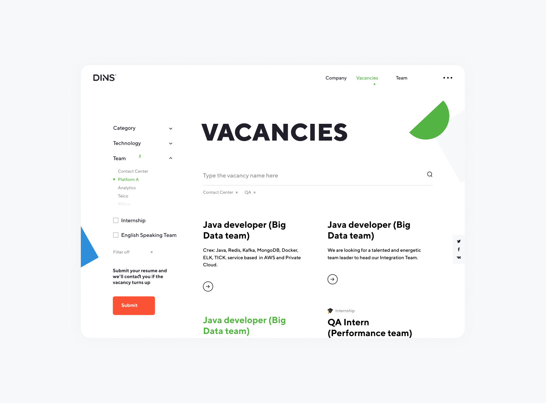
The primary goal of the career page is to showcase job openings in a way that allows potential employees to easily explore and find the right fit.
To streamline the search process, we introduced three key filters for sorting vacancies:
Categories
Technologies
Parts of the technology stack that DINS develops.
Teams
Each team works on a specific part of the cloud platform, with distinct goals and specializations.
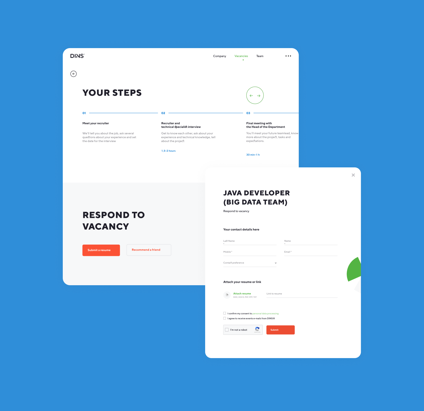
The page also allows users to submit their resumes even if there are no current openings, ensuring that DINS stays connected with candidates who share the company’s values and are interested in contributing to the platform.


DINS actively builds a professional community and sets a standard for IT culture. The company collaborates with other organizations to host events and shares its expertise through blog posts and social media.
All posts are organized into categories—DevOps, Java, JavaScript, and QA. Users can watch recordings of past events on the website, register for upcoming events, or join live broadcasts.
DINS also shares personal success stories from employees through articles and podcasts, encouraging candidates to submit their resumes.
The mobile version expands the website’s reach, ensuring accessibility on any device. This goal guided our approach to design prototypes and page layouts. As a result, all filters, forms, and controls are user-friendly across various screen sizes.
The current version of the website consolidates functions that were previously spread across multiple sites, including:
- Introductions to teams and products
- A blog sharing insights into the company’s internal life
- Job openings and feedback collection
- Event announcements and registration forms
Admin access to all sections is now streamlined through a single control panel.
The website design is also easily adaptable to other channels, with DINS using recognizable forms across all platforms.