E-commerce design for K-Rauta

K-Rauta is a Finnish chain of stores specializing in tools, construction products, and appliances, as well as housing and cottage sales. The market for building materials is highly competitive, so a store needs to be modern, customer-friendly, and engage with clients both offline and online to stand out. Our task was to design a new online store that would serve as a key part of the company’s communication with customers, seamlessly bridging the physical and digital shopping experiences.
We analyzed the market, studying competitors and their positioning. Most companies offer a range of construction and finishing materials, building tools, and household and garden goods. Competitive advantages typically include convenient locations, pricing, and interior design ideas.
K-Rauta stands out by offering spacious stores, easy navigation, and minimal queues. As part of a strategy to differentiate further, we set the following goals:
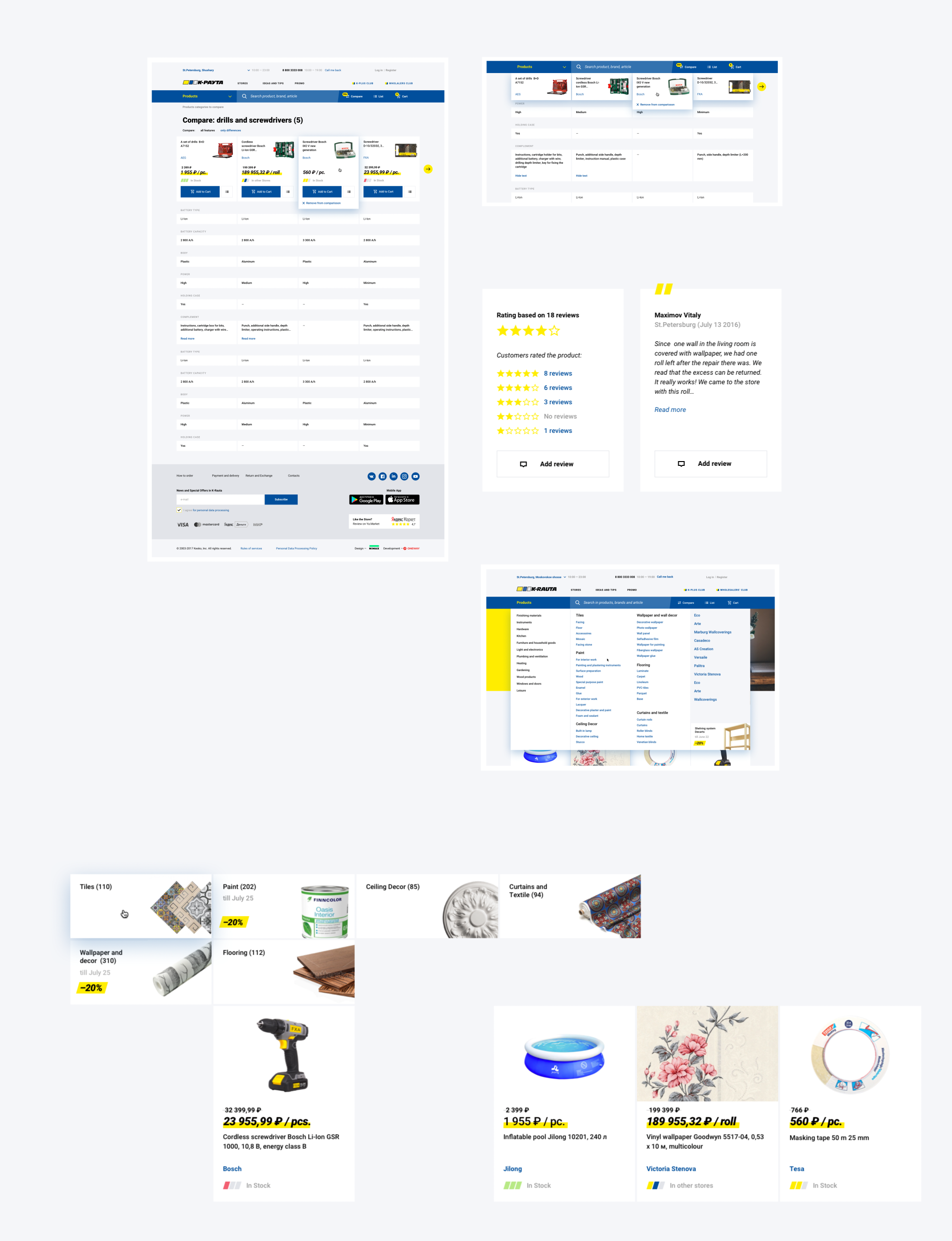
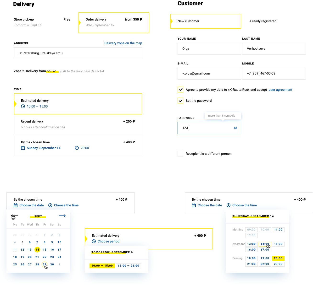
- Create an omnichannel system: Allow users to add items to their cart on the website, modify the list on mobile, pay at checkout or online, receive home delivery, or pick up items in-store.
- Emphasize additional services: Provide access to designers or technical consultants for assistance.
- Showcase real in-store interiors.
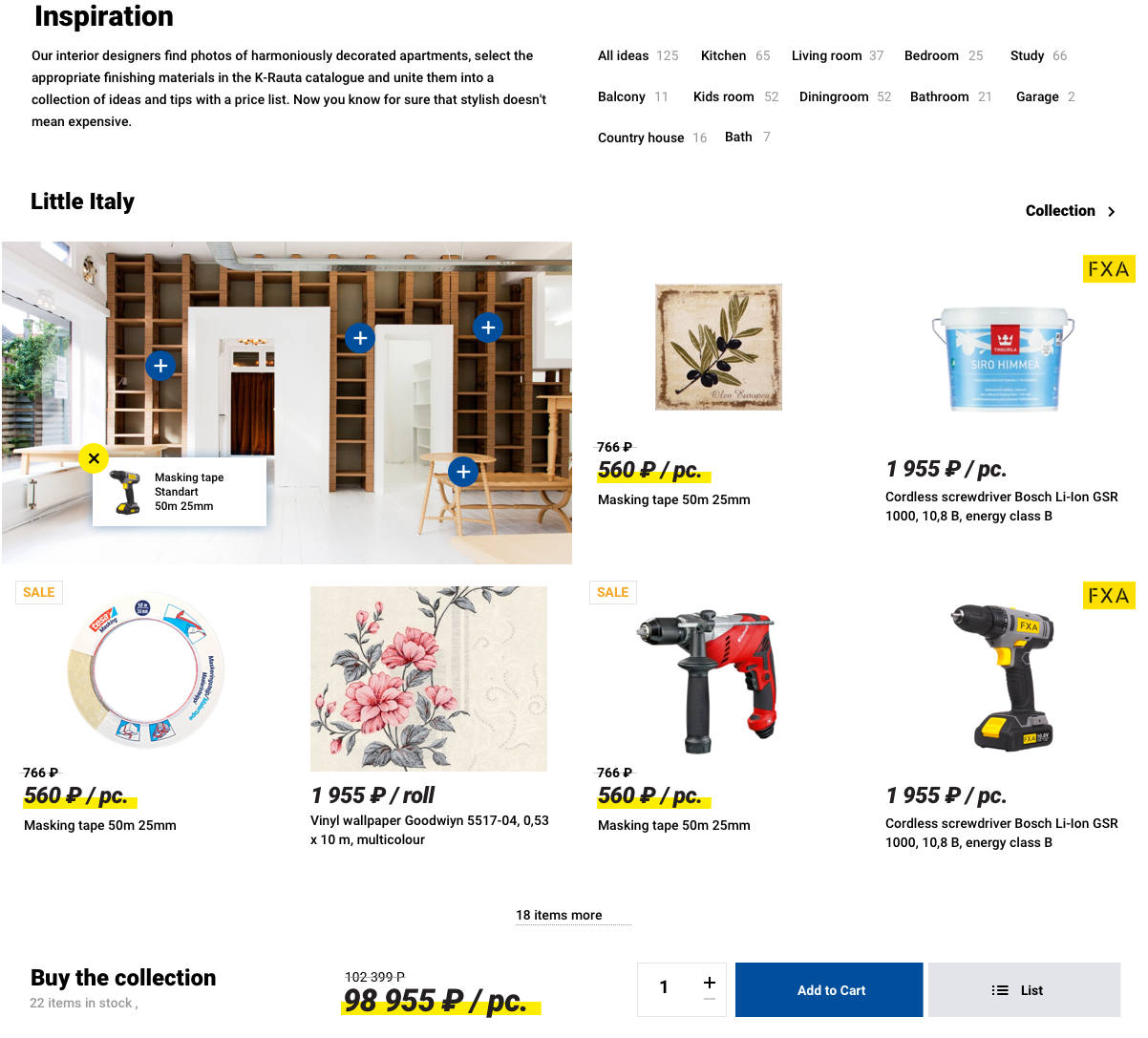
- Organize products into collections on the website to help customers find items with a cohesive style.
The next step was to identify and describe categories of online customers. We identified several scenarios for how they interact with the offline and online store—ranging from seeking inspiration to returning excess items after completing a project.
We mapped each user’s journey through four stages: search → convenient purchase → active repair process → completion.
K-Rauta’s role in this journey is to serve as an assistant and consultant, making the process as smooth as possible. To support this, we introduced ready-made collections from the K-Rauta catalog: customers can choose a solution online and, if needed, work with an in-store designer to customize it at no extra charge.
