Pizza Hut. Delivery website and App concept

Pizza Hut is a global pizza chain with over 15,000 restaurants worldwide. Our task was to design a website and app concept for one of the franchises, focusing on UX/UI to make ordering pizza as easy and seamless as possible. Users found the current Pizza Hut website difficult to navigate—73% of clients abandoned the ordering process before entering their delivery address, and only 10% of visitors completed a purchase.
The client asked us to adhere to the design concept set by Pizza Hut Digital Ventures (PHDV), a set of guidelines developed for Pizza Hut websites globally. PHDV provides detailed standards for every element of the website: logos, image sizes, icons, colors, information layout, and user scenarios. However, it does not account for UX specifics outside the US.
After a series of strategic meetings with the company management, it was decided that we could not follow the global guide strictly. The UX needed to be adapted for local use.
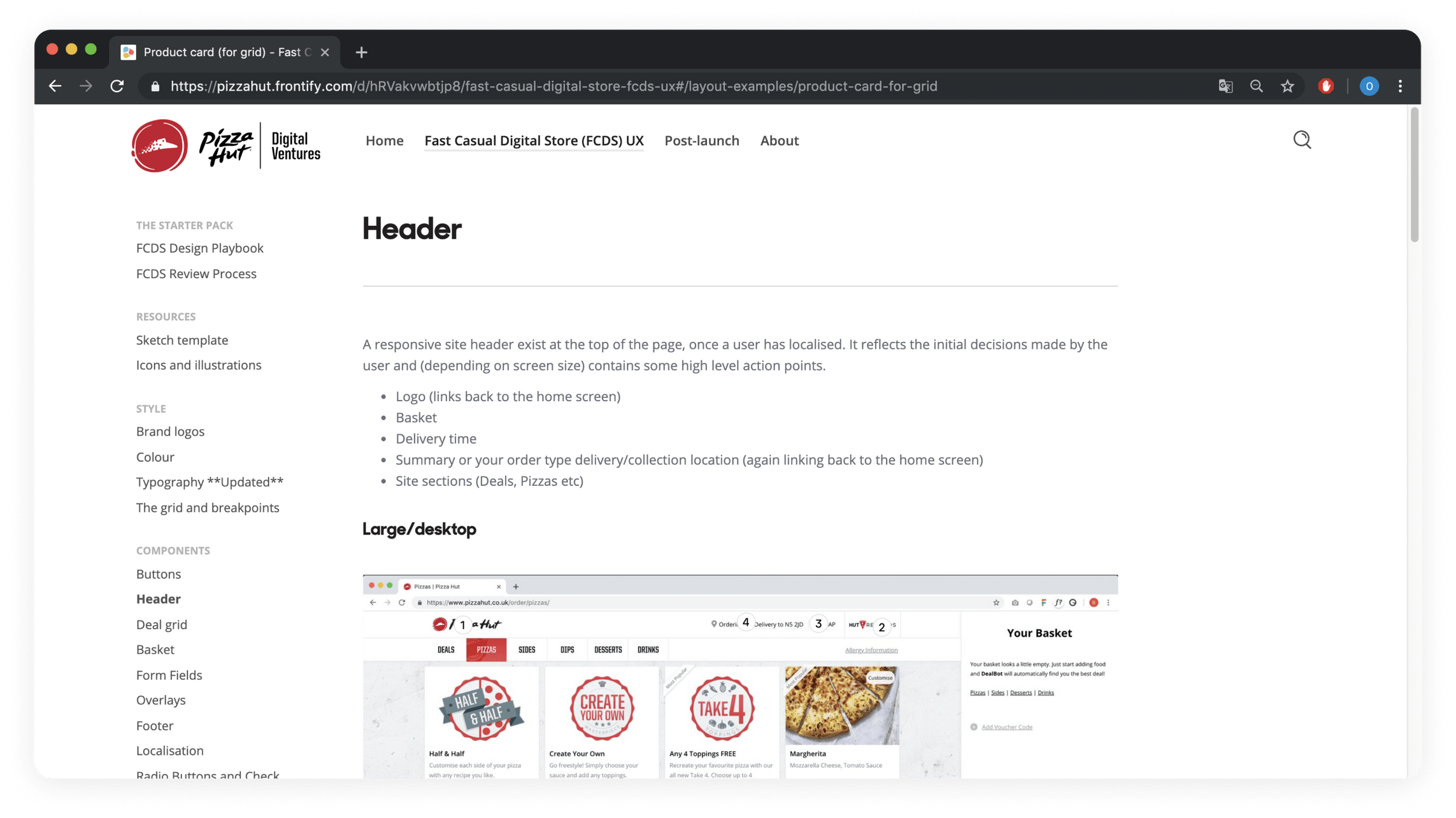
In the US, Pizza Hut customers typically start by entering their postcode to determine the delivery area, then proceed to choose their pizzas. They select toppings, choose their favorite crust, and double the cheese before placing the order. Detailed photos of the pizza are unnecessary, as each customer has a unique combination of toppings. This is the user flow outlined in the PHDV.
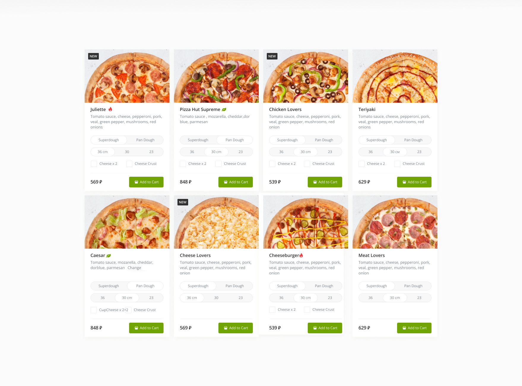
However, in the regions where our target customers are based, it is more common to select from a variety of ready-made pizzas. Customers tend to review photos to examine the pizza’s ingredients. Delivery details are only entered after the pizza is selected and the customer is ready to place the order. We adapted the web interface to align with these specific user scenarios.
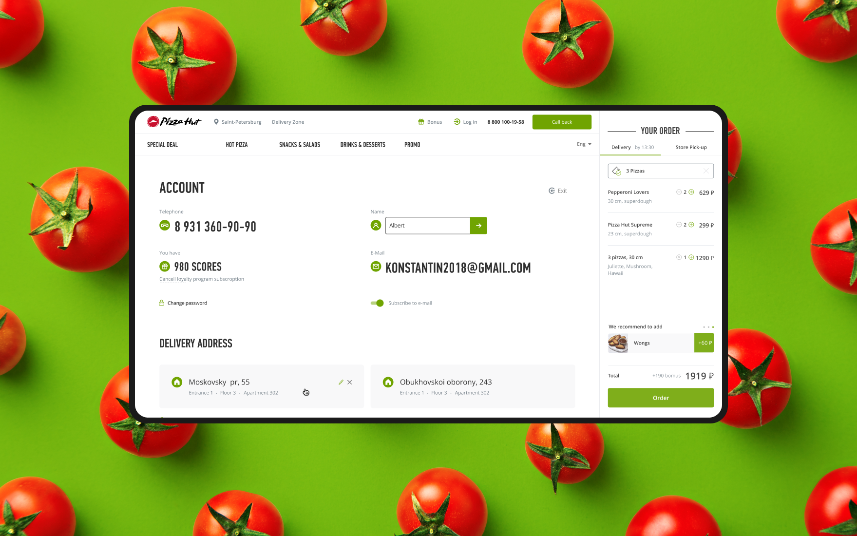
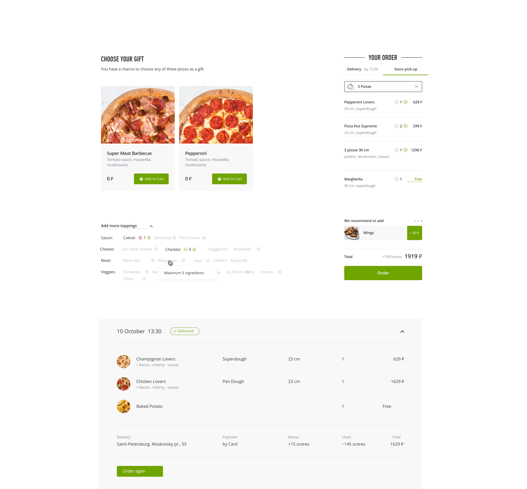
We developed a concept for a new Pizza Hut mobile app, tailored to meet local user flow demands and accommodate the features of the regional rewards program.
The website is still in development. The link will be provided here once available.
Our results include:
- Designing the interface with consideration for local UX features while adhering to PHDV standards
- Modifying the order and personal account pages to incorporate the local loyalty program features
- Modernizing and adjusting the interface design to align with current design trends
Client's feedback
This is not our first project with NMX. Despite challenging work conditions—tight deadlines, strict guidelines, and constant task changes—the NMX team has always delivered, guiding us toward the best decisions, offering alternatives, and supporting our ideas. A special thanks to the client-oriented project managers and the lack of bureaucracy.