Identity and Website for Weigandt Consulting
Weigandt Consulting specializes in designing, implementing, and supporting retail solutions, helping retailers boost profitability and gain a competitive edge by enhancing the user experience.
The challenge was to update Weigandt Consulting’s website to accurately reflect its core services and attract partners and job seekers. The website design should be fresh, modern, and eye-catching. Additionally, the website should be SEO optimized and ready for promotion.
We started with an in-depth brand audit, identifying gaps in the outdated identity that failed to convey the company’s core services or attract talent. Our goal was to create a consistent brand look for the website and other brand materials, giving us a strong edge over competitors.
The Logo
The brand identity concept is based on the role of the brand. The accented red square symbolizes Weigandt’s expertise, while the blue square represents the client’s business that needs this expertise. Together, they illustrate how Weigandt quickly meets client needs, accelerating growth and profitability.
Brand identity
The logo anchors the visual system, with a consistent red accent that runs through the modular design. This approach reinforces the brand’s modern, technological, and professional image.
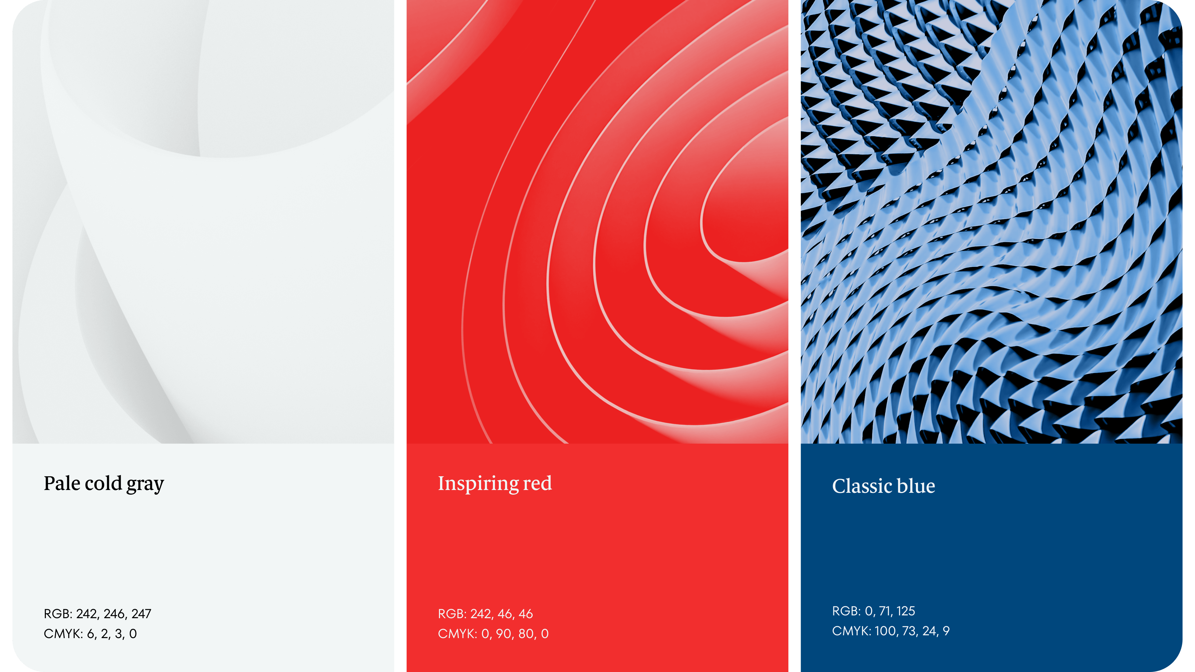
The colors
The choice of colors emphasizes both continuity and modernity. The new palette is based on colors familiar to customers but viewed from a new perspective: cleaner, clearer, and more intense.
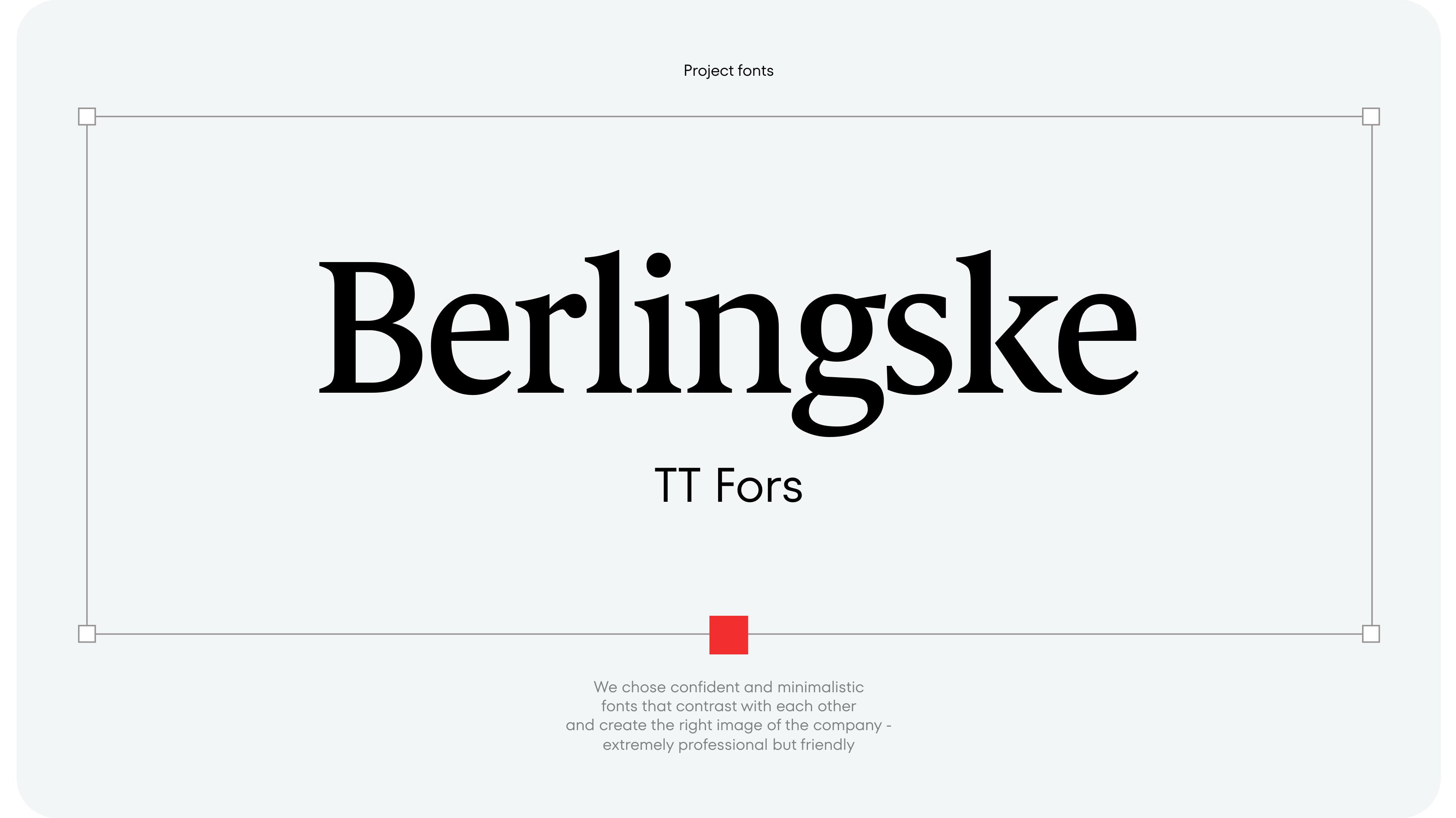
Typefaces
The accent font is Berlingske: bright, confident, and reliable. To complement it, we chose the contrasting TT Fors: minimalist, geometric, and uncluttered.
Carriers
In the final stage, we developed the design for various carriers, such as merchandise for customers and employees, presentation templates, business cards, and more.
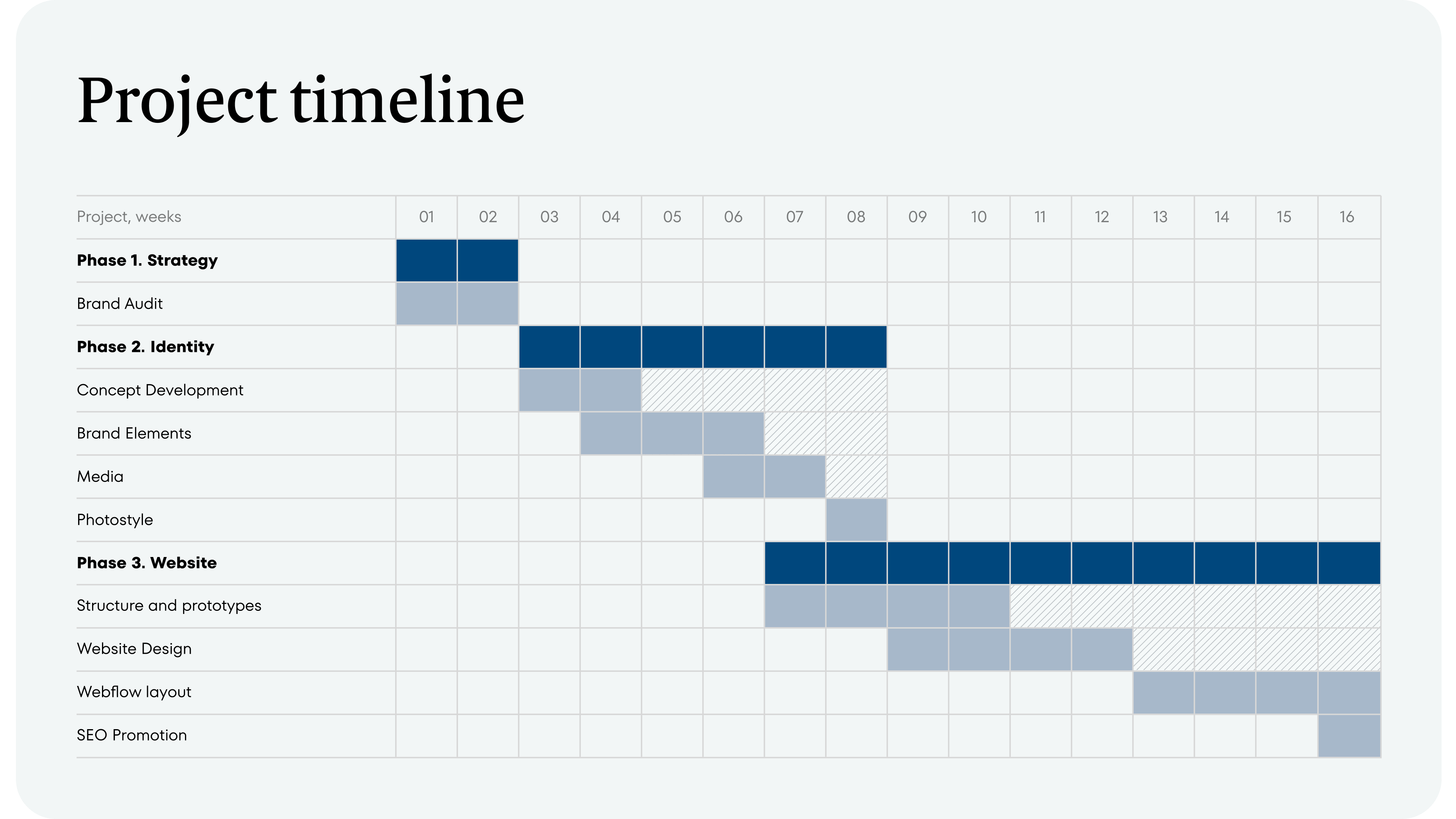
We started with a competitor audit, which informed our recommendations: a streamlined main menu, a case studies section, and clearly defined services tailored to customer needs.
Next, we combined business objectives with successful competitor practices to design a flexible, expandable structure. Before prototyping, we created a site plan in Miro with content blocks and their placement order. After client approval, we developed templates for each page, which the client filled with draft content. This process allowed us to create detailed prototypes consistently approved by the Weigandt team.
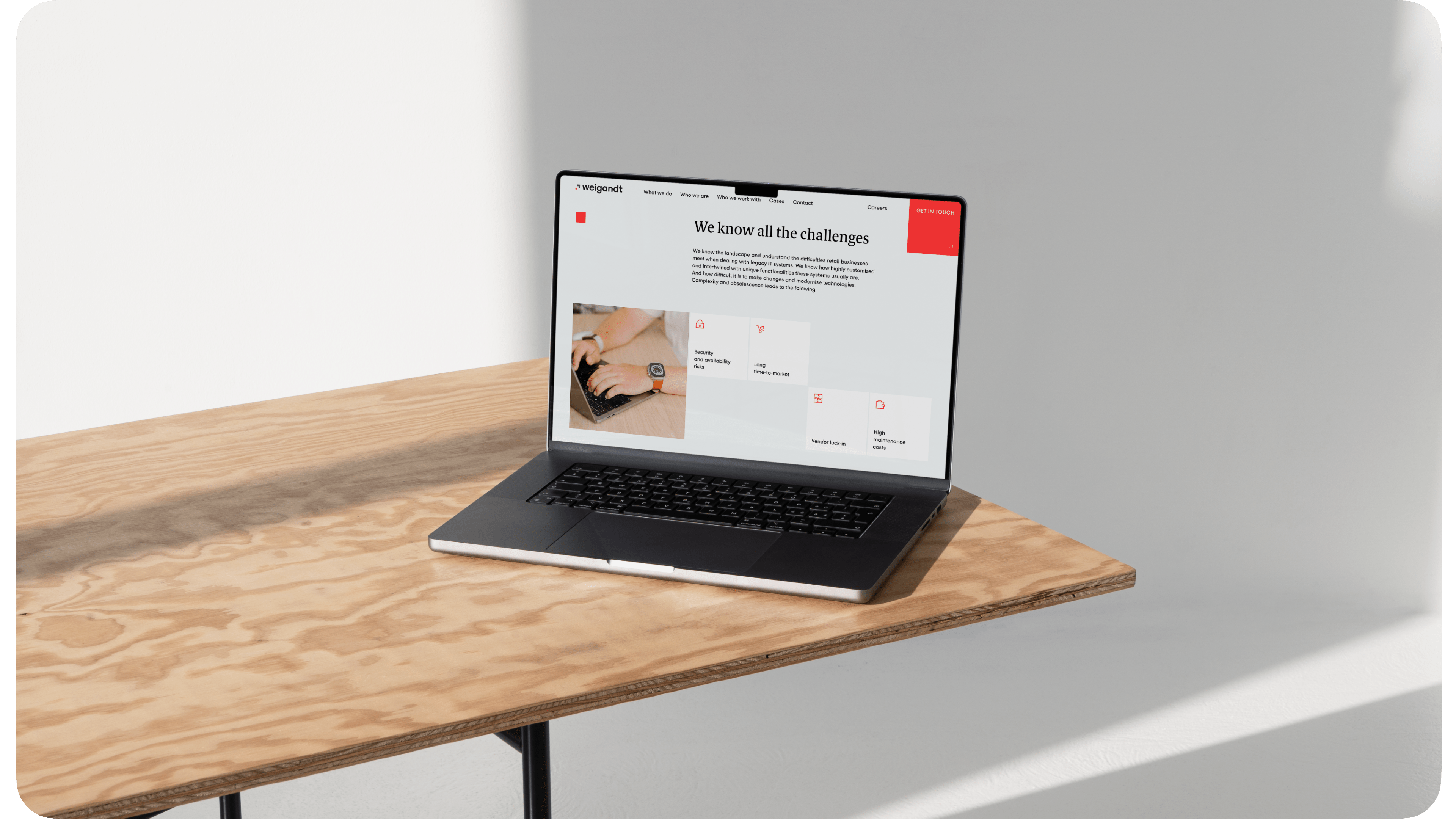
We started prototyping the site from the home page. We perfected the main screen, then added a block to show how the company turns business inquiries into opportunities through its services.
Next, we added a large customer section, starting with a digital map showing Weigandt’s global partners, giving customers an immediate overview of the company’s reach.
We then used project profiles—brief announcement cards describing the project and tasks without requiring a click. This format enabled us to showcase more case studies without burdening the client with additional work.
We also included client cards featuring the logo, company description, key figures, testimonial, project details, and results. These cards can be placed on different pages depending on the context. For example, on the services pages, we used sliders with cases, combining full cases and short project profiles. This provided real examples to support the services without needing to create many full cases.
Our design approach emphasized modernity, using ample white space and clean, functional typography. Subtle background colors, accented with bright tones and animated shapes, created a sophisticated, visually engaging experience.
During the briefing phase, the client identified a problem: the old website was hindering effective recruitment. It gave the wrong impression of the company and scared away potential employees.
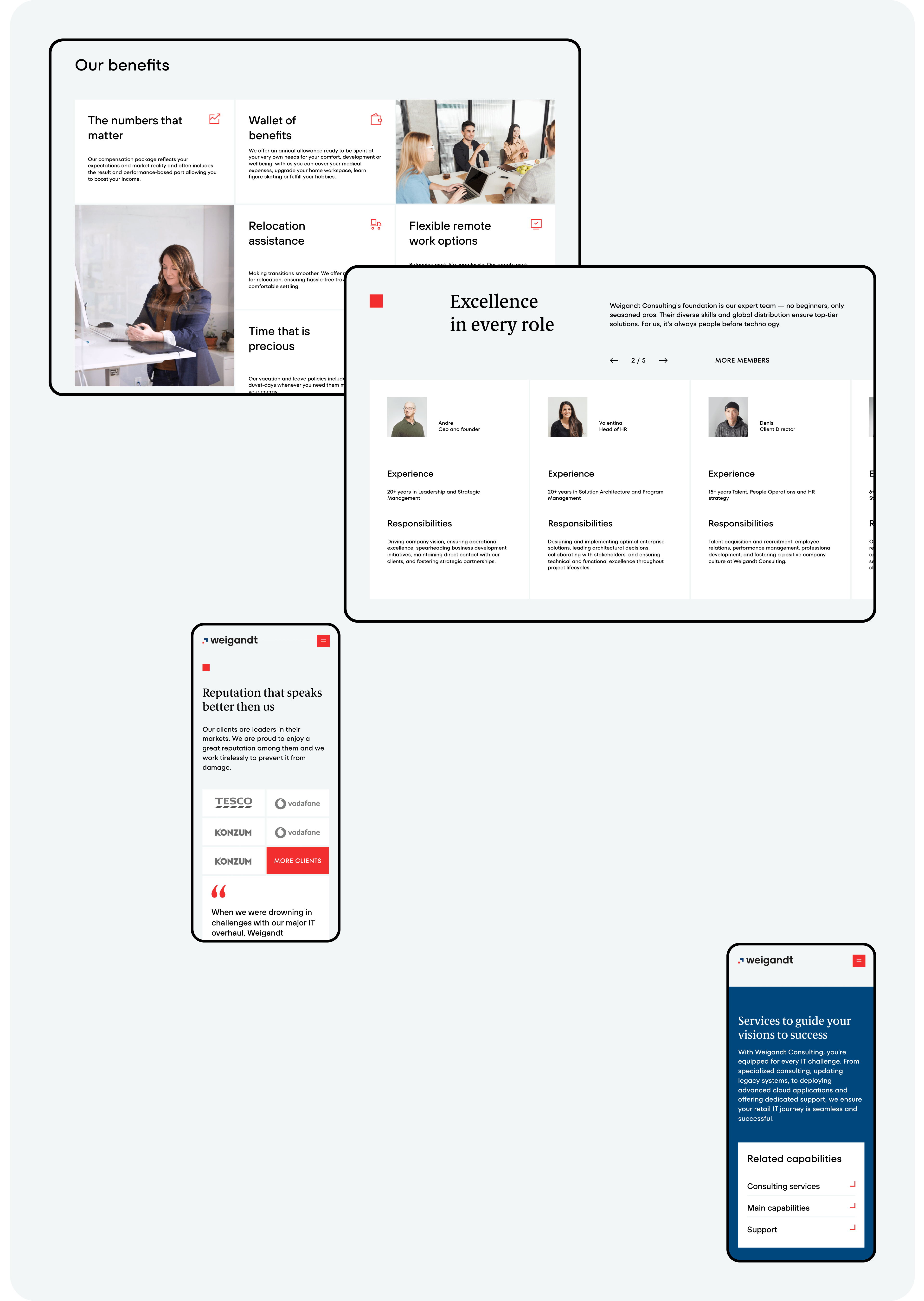
To address recruitment challenges, we developed a dedicated careers page that showcased the company’s culture, benefits, client success stories, and team dynamics. This approach significantly improved recruitment efficiency.
Results: Feedback from the client confirmed our hypothesis—a dedicated careers page with all the important information helps recruiters fill vacancies faster and more efficiently.
Besides the traditional WordPress layout, we introduced Webflow as an alternative — a visual code editor that allows greater flexibility in design without the need for backend development, reducing costs and speeding up implementation.
To ensure the site is well indexed by search engines, free of technical errors, and retains traffic when switching to a new version, we performed basic optimization before the launch:
- Prepared and implemented metadata.
- Created and populated sitemap.xml and robots.txt files.
- Set up redirects from old URLs to new ones.
- Checked and configured site indexing and added goal tracking in Google Analytics.
We developed a photographic style that allowed the client to shoot in the company’s office with real employees. Serious but open working atmosphere, friendly team members, bold and clean photo compositions turn potential partners into real ones.
- The site attracts traffic from target countries: the USA, UK, Germany, and the Philippines.
- The site appears in US search engine results for 22 queries.
- Traffic has increased 4 times.